HSL (Hue, Saturation, Luminance)

 
the lightroom learning group-logo-black.png
 

The HSL/Color panel sure appears to be intimidating!! But guess what? It's not that scary. 

The above images show you the EXACT same things, just in a different layout. The image on the left has colors grouped under Hue, Saturation and Luminance, respectively. While the image on the right has Hue, Saturation and Luminance grouped under each individual color. You can view it either way, there is no right answer for the "correct" view. I will find myself working sometimes in the view on the left and sometimes in the view to the right. 

But let's break down for a second what exactly it is that we're adjusting when we use the HSL sliders. 

Think of Hue as a paint swatch. You can walk into Home Depot and see 5 different variations of Blue on one swatch. Those are Hues. Every color* has Hue and when you push a Hue to one side or another you will change that colors appearance - maybe a little more blue or a little more purple(just one example).

Every color*, of course, has Saturation as well. And Saturation, as you probably know, is really just a colors intensity. Using Blue as an example, if you increased the saturation that intensity will grow more and more, creating a more vibrant Blue. If you decreased the saturation of Blue, it would become less and less vibrant and turn pale - almost to grayish white. 

Lastly, every color* also has a Luminance value. This can be thought of as brightness. Similarly to Saturation, Luminance will also effect the intensity of a color but more so on the brightness side of things. 

*every color does not include black or white. Those "colors" can only be black or white.


We're going to use this simple graduated blue block (above) for a bit to demonstrate Hue, Saturation and Luminance.

Above we have 2 variations of the same graduated blue block. The image on the left shows the Hue pushed all the way to +100 and the image on the right shows the Hue pulled all the way down to -100. You can clearly see how the color shifts when you do this. +100 gives a Purple Hue, while -100 gives an Aqua Hue - yet both are still technically Blue. 

And in the two images above we increase the Saturation to +100 (left) and decrease the Saturation to -100 (right). You can see that not all the color is removed when taking the Saturation slider to -100, very rarely will that occur. You'd need to have the numerically correct values for Blue to have it completely desaturated and that, likely, won't happen in normal shoots.

Again using the same blue gradation image we can see above what happens when the Luminance is adjusted. The image on the left is quite a bit brighter than the image on the right. This is due to the fact that the image on the left has the Luminance (brightness) pushed to +100, while the image on the right has the Luminance (brightness) pulled down to -100.


Ok, so let's use this in a real world scenario on a real image.

Above is an image from the shores of Lake Superior (some of you may know this very spot). This is a personal favorite of mine but I want the sky to pop out just a little bit more. So I will use the HSL panel to do so and in this particular image the sky appears to be blue... So I will adjust the HSL sliders under "Blue".

As you can see I bumped up the Hue +25, kicked the Saturation up to +13 and decreased the Luminance a bit to -16. The end result is a dark blue - almost with a hint of Purple - sky that contrasts a bit better against the white clouds. Now I want to adjust the beach a little as well.

So just by simply looking at this image I can tell that the changes I want to make will likely be in the Oranges, so I head to the Orange section of the HSL panel. For this adjustment I actually took the Hue down (-14), added some Saturation (+19) and added some Luminance value as well (+17). They are subtle changes but overall I think I like the end result - granted it could still maybe use a little exposure adjustment in the Basic Panel but this about HSL! Check out the before and after "sliding" image below.


Alright guys, there's your HSL overview! Not too scary, right? We'll go over all of this in an upcoming Video Tutorial but for now if you have questions, leave a comment or shoot me a message!

Lightroom Classic CC Update 7.4

 
My Post Copy.jpg
 

Alright guys it's update time! If you haven't caught on to the "schedule" just yet, Adobe releases "major" updates to Lightroom (and other software) about every two months - pretty consistently. The last update in April, most notably, brought us Profiles. There's nothing quite that exciting in release 7.4 but there's some good stuff here. Below is a quick rundown.


I'm a huge fan of Lightrooms' ability to help users organize images and folders and there was a pretty nice update in 7.4 in regards to that. You can color label your Folders and then organize by color. To add a color label simply right-click or ctrl-click on a folder and select "Add Color Label" (see images above). Easy and useful!


One update that nobody seems to be talking about but proves Adobe is paying attention to users (and quite possibly our little group since this was brought up by a member - kidding they don't know we exist) is the new easier to see grid lines when using the Crop Tool. This one, however, comes with a slight caveat. If, in your preferences, you do not have "Use Graphics Processor" checked you won't notice a difference in the Grid line size (see the pics above. The left is without Use Processor Checked and the right is with it checked). This is a bug that Adobe is aware of they will address it in another "non-major" update soon. 


Another nice little improvement is the ability to "Manage Presets". If you right-click or ctrl-click on the plus (+) sign next to the Presets title you will now see the option to "Manage Presets". You can then select (check) or hide (uncheck) the Preset Categories that you want visible. 

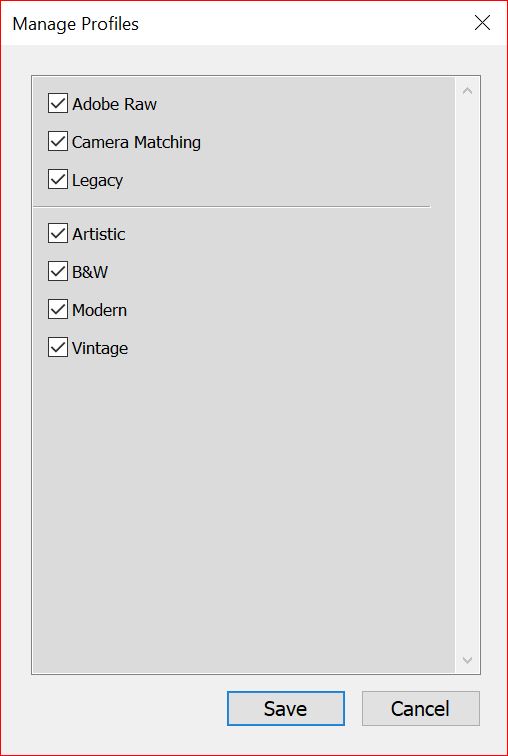
And you can do the same with "Profiles". Simply open the profiles panel and right-click or ctrl-click on a Profile name to get the sub-menu and choose "Manage Profiles". Again, a check mark indicates it will be visible and un-checking will hide the Profile Category.


The last update that I wanted to touch on was the new ability to "Stack" images together when creating an HDR or Panorama image (we haven't discussed either of these two image options but we will!). Previously you would have to create your HDR or Pano image and then create a stack - if you wanted them stacked(which I mean why not??). Now you have the option to select "Create Stack" when in the HDR or Panorama dialog box and Lightroom will automatically stack them when the process is complete, leaving the HDR or Pano image at the top of the stack. In the images above I have shown the dialog box and then the Stacked photos and also the un-stacked photos. You can see, in this demonstration, that I used 3 images for an HDR and Lr stacked 4 - the 3 originals and the final HDR. I also show you the 4 images as being unstacked with the HDR image circled in blue. 


And there ya have it! The main points of interest from the Lightroom Classic 7.4 June 2018 Updtate. There were of course other small bugs that were squashed and new cameras and lenses added to the Lr database but this is what I felt was the important stuff. Let me know if you have any questions!

Create a PNG - or background-less - Watermark

 
the lightroom learning group-logo-white.jpg
 

In this review blog post we'll go over how to make a PNG or background-less watermark. I say review because we covered it in a tutorial that you can watch here. But I always think it's beneficial to have a video and written instructions.

export.JPG

So to start, you want to have an image open in Lightroom - any image. Then simply right-click (or control + click) on the image to open the context menu. Next, you'll want to head to the Export option and select "Export..."

export1.JPG

Next, scroll down to "Watermark", making sure that the option is checked, and click the double arrows. Then, select "Edit Watermarks..."

export3.JPG

If you then select "Graphic" you will be prompted to open a JPEG or PNG file. Above is a watermark using a JPEG image. As you can see it has a white background and is not the effect we are going after. What we want is a PNG with NO background.

export4.JPG

To create a PNG you want to open Photoshop . Next, open your Logo file - which can be a JPEG.

export5.JPG

When you open your file it will be the"Background" Layer and have an eye next to it. The next step is VERY important. You want to COPY the Background layer by clicking on it and dragging it to the lower right where the page with a turned up corner is - let go and you will have a copy of your background. 

export6.JPG

Next, uncheck the Background Layer by clicking on the eye to the left of the layer icon.

export7.JPG

Now you'll want to select the background pixels, in this demonstration the white pixels. To do this the best option is go up to the "Select" Menu and choose "Color Range".

export8.JPG

You will then see a dialog box with options for selecting. I suggest setting the Fuzziness to 200 or there about as this will create the most contrast for the selecting pixels and make a more accurate selection (assuming you're working with Graphics or Text). Now click on the area in the preview box that has the pixels you want removed. Click "OK" and then you'll see the "marching ants" going around the area that you want to remove. Next, very simply click the "Delete" button and the background pixels will be deleted, leaving only the logo.

export9.JPG
export10.JPG

Once you have your pixels removed it's time to create your PNG file. This is quite easy, actually. All you need to do is go to the File Menu and click "Save As..." Next scroll down to the PNG option and click that and then click save. Be sure to save it to a location that you will remember. 

export12.JPG

Now you want to create a Watermark with your new shiny PNG file. So head back to Lightroom and repeat the steps to creating your watermark. Be sure to click "Graphic" and then click the "Open" button (on a PC your file browser may open automatically).

export13.JPG

Fianlly, locate your PNG file and select "Choose" to add the file to your Watermarks. Adjust size, location and opacity how you'd like and click "Save". Your PNG background-less watermark can now be added to any image you export in the future. 


Feel free to leave comments or questions below or leave a message on the Facebook page!

Share Images via Email from Lightroom


Email is of course a great way to share images and you can share images via email directly from Lightroom. Sending images via email from Lightroom is actually quite simple - usually. It is an "Export" process. So all you have to do to start the process is Right-Click (or ctrl(pc)/cmd(mac) + click) on the image you want to email and select Export > For Email. This will bring up a dialog box (as seen below) that has the options for your email. 

Screen Shot 2018-05-22 at 6.42.38 AM.png
Screen Shot 2018-05-22 at 6.42.55 AM.png

Starting at the top you insert the email address that you want your email to be sent to - you can start an Address Book by clicking the Address button in the upper right. If you plan to send to multiple addresses at once I suggest adding email addresses and names to the Address Book first as this will save you time in the future - for some reason Lightroom has an issue sending to multiple email addresses if they aren't in the address book and I honestly don't know if this is intentional or a bug. And below the "To:" box you have your "Subject" and to the right of that you have your "From" box. And this is where it can get  a little tricky. 

When you click the double arrow next to the "From:" box you should - hopefully- see your email provider - Gmail for example. Then you want to select your provider and navigate to "Authentication Method" and make sure "Password" is selected. Then, below that, enter your email and password and click "Validate". You should be good to go!

*try following the instructions below if you are unable to send an email*

Now, depending on your security settings from your email provider this may or may not work. You may get an error message when attempting to send. If you do head to your email and navigate to the security settings. Below is an example of the security settings on Gmail from their mobile site. 

In the Gmail example, head to the "App Passwords" section and select "Other". I typed in "Lightroom" when asked for a name for the App and told it to generate a password. Then copy and paste that password into the password section in the email dialog box in Lightroom. After that you should be up and running and ready to send an email!

Screen Shot 2018-05-22 at 6.47.49 AM.png

Now since this is an Export Process that means that you can use an Export Preset when you want to send an image via email. If you recall we covered creating an Export Preset in a vide tutorial that you can find here. If you do decide to create and use an Export Preset for sending your images via email then when you right-click on image you would select Export then the preset you created, not Export For Email. 

Screen Shot 2018-05-24 at 7.01.39 AM.png
Screen Shot 2018-05-22 at 6.49.52 AM.png

And there ya go! That's how you email images directly from Lightroom. Give it a try and see how easy it can be to share your photos with email! As always, if you have any questions let me know or post in the Facebook Group!


Smart Collections

 
28947355_1764862206904301_4092862087972235594_o.jpg
 

Everyone has a Smartphone. Some people own Smart Speakers. You and I have Smart Collections! Of all the "smart" labeled things in this world I would argue that none is better than the Smart Collection. So what makes a Smart Collection so "smart"? Well, let's talk about that!

We have already discussed regular old Collections and those are great - you can put any images you want into them - but Smart Collections take Collections to the next level. Instead of you selecting the images for the Collection, Lightroom selects the images for you - based on criteria you input. 

To create a Smart Collection you can tap on the "+" next to the word Collections in the left panel and select "Create Smart Collection" or go the Library Menu at the top of your screen and select "New Smart Collection". Either way you will get the same result, a dialog box that allows you to input the criteria to filter the images for your Smart Collection (see image below).

 
Screen Shot 2018-05-10 at 6.44.17 AM.png
 

Screen Shot 2018-05-10 at 6.44.34 AM.png

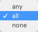
And this dialog box is where you get to set the specifics of the Smart Collection - and you can set A LOT. But before you start setting the criteria for your Smart Collection there are two options to be aware of. One is "Location" and that allows you to pick which, if any, Collection Set you want your Smart Collection to be a part of. The second, and this one is very important, is the "Match" option. You will have three options to choose from - Any, All and None. "ALL" is the default and this tells Lightroom that you want your images in the Smart Collection to match ALL of the criteria you input. You can think of the "All" option as AND - the criteria has to be this AND that AND the other. Another option is "ANY" and this tells Lightroom to match ANY of the criteria you input. You can think of the "ANY" option as OR - the criteria has to be this OR that OR the other. So the "ALL" option will give you more specific results. The final option is "NONE". This option simply excludes the criteria you input. For example, if you set the Label Color to Red and have NONE as the Match option then you will have a Smart Collection of images that DO NOT have a Red Color Label. My preference is to have "ALL" selected as the Match option. 


Screen Shot 2018-05-10 at 6.44.57 AM.png

Then once you have the "location" and "Match" options set, it's time to submit your criteria. Now I am not going to go into all the criteria you can enter, I will just say that there is a plethora of options for creating your Smart Collection. You can use Labels or dates or lens type location and on and on and on. You can get really specific, or you can leave it fairly broad - it's up to you! You can create as many Smart Collections as you want - just like you can create as many Collections and Collections Sets as you want.

A couple tips for making Smart Collections work to the best of their ability - ALWAYS use keywords. We've discussed before how important keywords can be and when using Smart Collections it be quite helpful to filter via keywords. Make sure you that your camera info is correct! Double check the date and time in your camera's settings so that you can create accurate dated Smart Collections. Also, be sure other metadata is correct - lens type for example - as you can create Smart Collections based on Lens Type. If you all your info and metadata is accurate your Smart Collections will be brilliant 😉(see what I did there? Smart / Brilliant )

So really how you use a Smart Collection is up to you and I can't tell you a right or wrong way to use them. But I assure you that if you explore them a bit and try them out and test different attributes/criteria for your Smart Collections, you will wonder how you ever lived without them! So now that you're done reading this blog post quit procrastinating and go make a Smart Collection! 

Collections; An Introduction To A Better Workflow

Collections. I would argue the MOST unappreciated, overlooked afterthought in Lightroom Classic. If you have been ignoring them please stop. They WILL make your life easier. They WILL make your workflow stronger - understanding them is key to good Lightrooming. 

So there are three categories of Collections. Collections - which is best compared to a single folder of images. Collections Sets - which is best compared to a folder hierarchy system containing multiple Collections. And lastly, Smart Collections - which is best compared to wizardry (actually probably best compared to a saved search). In this post we will cover Collections and Collection sets and save Smart Collections for another post. 

Collections can be found in the left panel - no matter what Module you are in. Yep, Collections are so important that they appear in every single Module. You can drag and drop a single photo into a collection or select multiple images and drag and drop into a collection. You can also set a collection as the Target Collection. This can make your workflow even faster. To set a Collection as the Target Collection simply right-click on the Collection you want to "Target" and select the "Set As Target Collection" option - you will see a plus (+) symbol next to the Target Collection. Once you set the Target Collection you can use your "B" key to add to that Collection. Simply select an image or multiple images and tap the "B" key, those images will then appear in the Target Collection. You can also right-click an image (or multiple selected images) and choose "Add To Target Collection" to add images to the Target Collection.

Collections can be found in the left panel.

Collections can be found in the left panel.

Right-Click on the Collection you want to Target and select Set As Target Collection

Right-Click on the Collection you want to Target and select Set As Target Collection

You will see this icon in the lower right hand corner of an image that is in a collection

You will see this icon in the lower right hand corner of an image that is in a collection

How many collections can you have? As many as you want! What images can you add to a Collection? Any images that you want! Does adding an image to a Collection move it's location? Nope! Adding an image or images to a Collection simply ADDS them to a new "viewing folder" (Collection) it DOES NOT move them from ANY other location in Lightroom or your computer. Any image within your Lightroom Catalog can put in a Collection.

So what should you use collections for? Well that is totally up to you but I can give you a few suggestions. I would suggest having a Collection Set for 5 Star images with 2 Collections in the set, one collection for color images and one collection for BW images. Then maybe a collection for Social Media - images you have shared or plan to share. One collection for images you plan to put on your website. Maybe you want a Collection for all Landscape photos and one for all Family photos and one for all Portrait images and one for Cityscapes. I also have Collections by year (sometimes a Collection Set per year and the months as Collections within the set). Well, hopefully you get what I am going for here - you can have Collections and Collection Sets for just about anything! And hopefully you are starting to realize how helpful collections can be to your Lightroom workflow! 

Zoom (Take it to 11)

 
My Post Copy.jpg


Zoom. A seemingly basic and boring function. You click, your image gets bigger, yippee. But think about it for a second, you probably use the zoom function a lot - checking sharpness, looking for artifacts - more than you might even realize. And being Lightroom, there are of course multiple options to the zoom tool, so let's take some time and explore it a little more. 


zoom_level_fullscreen.jpg


In the top portion of the Navigator section of the Left Panel you will find the options for the Zoom Tool. But keep in mind that there is no actual tool to select - it's not like the Adjustment Brush or Clone Tool. You can Zoom in on your image by using the controls in the panel or by tapping the "Z" on your keyboard - that will zoom in on the last place you clicked with the zoom tool. Alternatively, you can use the Spacebar to access the Zoom Tool. When you click and hold the Spacebar you will see a magnifying glass that you can move around your image to the location that you want to magnify. Upon clicking and zooming in  you will see a hand that you can then click and pan with. 


Screen Shot 2018-04-24 at 9.30.41 PM.png
 

In that upper portion of the left panel you will see the magnifying ratios for the zoom tool. First you have the default zoom views - FIT and FILL. Clicking the FIT option causes your image to expand or contract to a size that FITs entirely in the viewable area - you will see the whole image. You will also likely see some background color as well (gray by default). When you click on the FILL option it will cause your image to expand or contract to FILL the entire viewing area - leaving NO background is visible. Think of FIT and FILL as your default sizes and also think of them as being completely separate from the other zoom ratios (I'll explain why a little later). So FIT = fit the image to viewable screen and FILL = fill viewable screen with image. 


After FIT and FILL we have1:1(100% pixel view) followed by the other zoom ratios that can be selected by tapping on the double arrows to the right of the magnification values. 1:1, like FIT and FILL, is static - you can't move or interchange other values in it's place. The other ratios, however, can be adjusted. From as small as 1:16 and as magnified as 11:1. Why would Adobe choose 11:1?? Well it's one of my favorite little Lightroom secrets. Did you ever see the classic movie This Is Spinal Tap? Well, it's a reference to that movie. Check out the clip below if you haven't seen the movie or if you just want a good laugh!


Above are sample images at all the zoom different magnifications.


Earlier I advised you to think of FIT and FILL separately from the other zoom magnifications. Here's why - when you zoom in Lightroom will go the last magnification you had selected, 1:1 for example. When you zoom out Lightroom will go to the last screen mode you selected, FIT for example. Stick with me for a second - so if you click on FIT, Lightroom will FIT your image into the viewable screen area - when you click 1:1 Lightroom will zoom to a 100% pixel view and when you tap the "Z" key (or use the Spacebar to activate the zoom tool and click with the magnifier) Lightroom will toggle between FIT and 1:1. In another example, If you click FILL, the image will fill your viewable area and if you then select 1:2 for the zoom magnification, you will get a 50% magnification view. So the zoom tool would then toggle between FILL and 1:2. Make sense? So, it has helped me in the past to think of them separately and then I remember better what will happen when I use the zoom tool.


There is one last feature of the zoom tool that you should know and it's hidden in the Preferences Menu. If you navigate to Preferences > Interface you will find, toward the bottom, an option titled "Zoom Clicked Point To Center". If you check this box Lightroom will center (the best it can) where you click with the Zoom Tool. If you leave the box unchecked (my personal preference), Lightroom will magnify and leave your cursor exactly where you clicked. Take a look at the video below to see the difference. There is no right or wrong option here, it's simply your preference. 


Alright guys, hopefully that answers all your questions about the ever-exciting Zoom Tool in Adobe Lightroom! As always let me know in the comments or on the Facebook page if you have any questions.


Transform

 
My Post Copy.jpg
 

Using The Transform Panel

 
Screen Shot 2018-04-18 at 9.22.46 PM.png
 

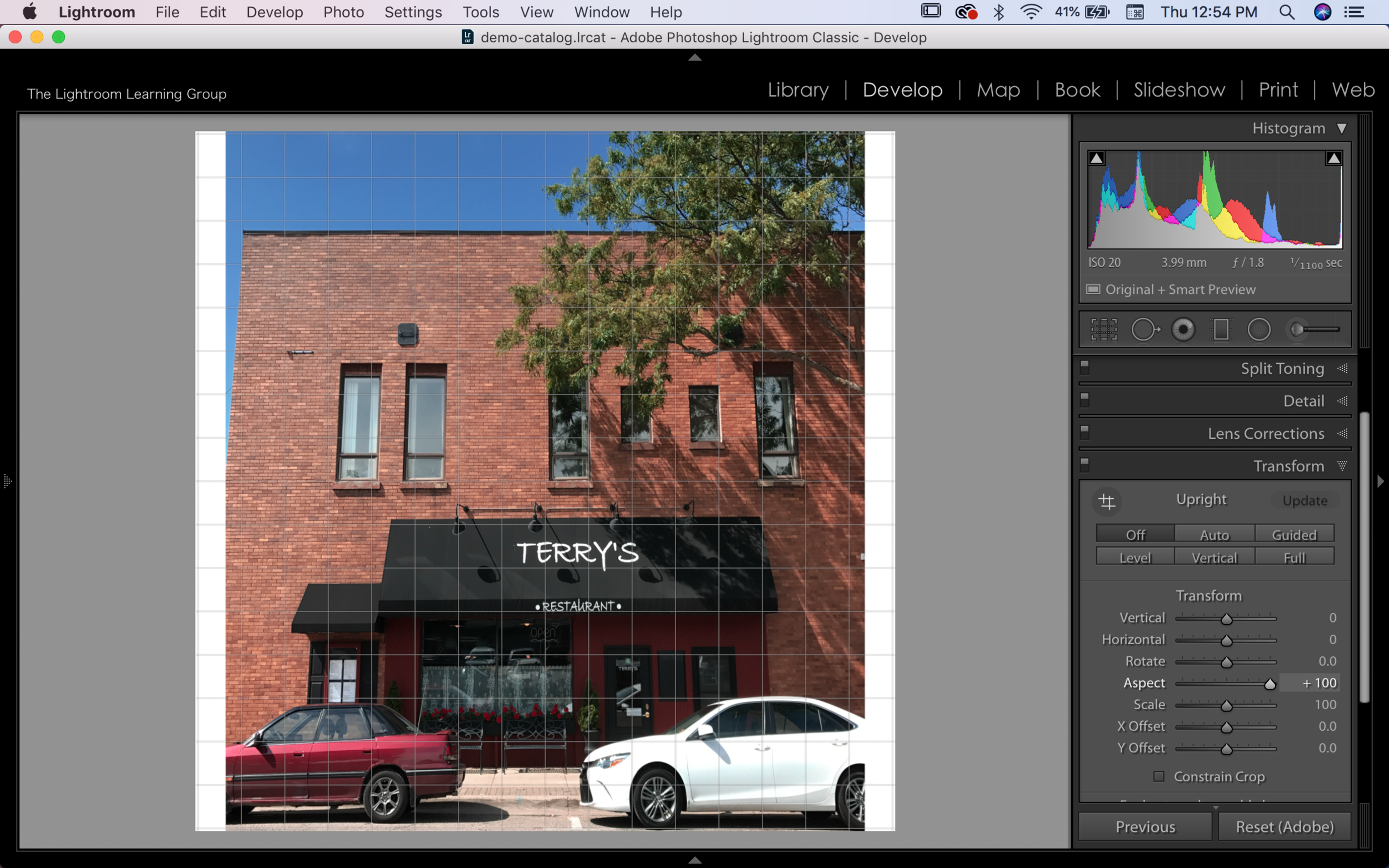
Toward the bottom of the Right Panel in the Develop Module you will find the Transform Panel and you can do some pretty neat stuff from within this panel. In my opinion, this panel should be grouped with, or at least near, the Crop Panel as they both effect the size and shape of your image. I find I rarely use the Transform Panel for my landscape photographs but it is tremendously helpful for urban or architecture photography. The panel holds the best ways to correct different forms of distortion that can regularly occur when photographing straight lines. With the images below I'll demonstrate what the different options and sliders of the Transform Panel do to your image. In these images I DO NOT have "Constrain To Crop" on but when performing these tasks you should have that checked - the white areas in the images would then be cropped out. (Tap the images to make them larger)


In the images above I have the original Image on the left and on the right I have clicked on the "Auto" option of the Transform Panel. When you click the Auto button Lightroom applies a balanced combination of all the other options in the Transform Panel. Many times, as in this demonstration, it is a very subtle change.

Demonstrated above is the use of the Guided function, which I find to be the most useful function in the Transform Panel. With this function you draw lines across what lines should be perfectly horizontal and perfectly vertical. You can place up to 4 guide lines - representing vertical level, horizontal level, the x axis and the y axis. 

Demonstrated above is the Level option and you can think of it as the Auto-Straighten option and the results, like above, could be potentially minimal if your image started out relatively straight.

Above is the Vertical option and this corrects for Level and converging vertical lines - again, not always a dramatic effect.

The final "button" adjustment is the Full option and this can have a dramatic effect on your image. This applies a level and converging - horizontal and vertical - lines correction. 


Above is a demonstration of the Vertical Slider and as you can see adjusting this slider will "stretch" the image. You can think of it as rotating along a horizontal axis in the middle of the image while stretching the image.

The Horizontal Slider, demonstrated above, is quite similar to the Vertical Slider. The image will stretch and rotate on a vertical axis.

The Rotate Slider will do just what it says. Depending on which way you move the slider the image will rotate to the left or to the right.

Above is Aspect Slider and this will change, naturally, the aspect of your image - making it narrower or wider depending on which direction you move the slider.

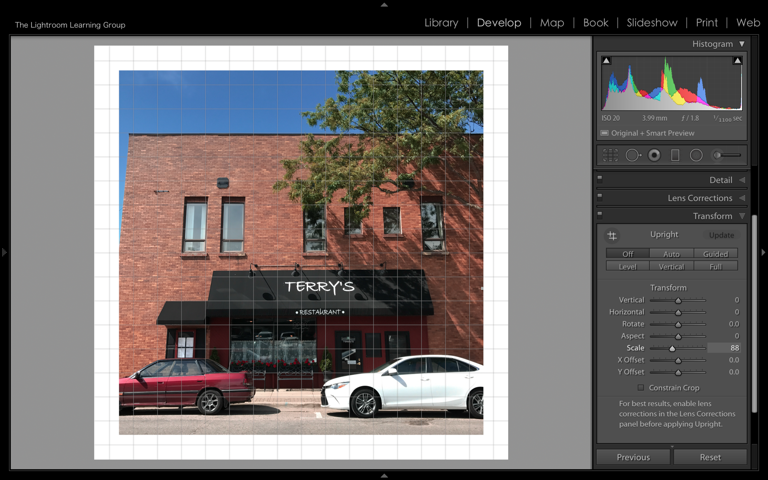
You can enlarge or shrink your image by using the Scale Slider.

Finally, the X Axis slider will move your image left and right. while the Y Axis slider will move the image Up or Down.


And there you have it, the Transform Panel. Go ahead and experiment with it a bit - it can be fun! Remember everything you do can be undone in the History Panel or by using CMD/CTRL + Z keyboard shortcut. 

The Lightroom Folder

Some of you have expressed some confusion about the Lightroom Catalog and the folder that is labelled "Lightroom" on your Hard Drive - and it's ok to be confused. Lightroom does not function like the file folders we have been using for years and years and wrapping your head around it can be challenging and frustrating! Just to be clear the main Lightroom Folder and the Catalog are different things. They are only associated by the fact the Catalog is stored, by default, in the main Lightroom Folder.

Now the Catalog was covered in one of the first blog posts for the group and you can read that HERE. But maybe you've read that and are still confused or maybe you understand the concept of the Catalog but still don't quite understand what all the folders in the Lightroom main folder are. Again, it's ok to be confused but let's try to clear this up and talk about the main Lightroom Folder. 

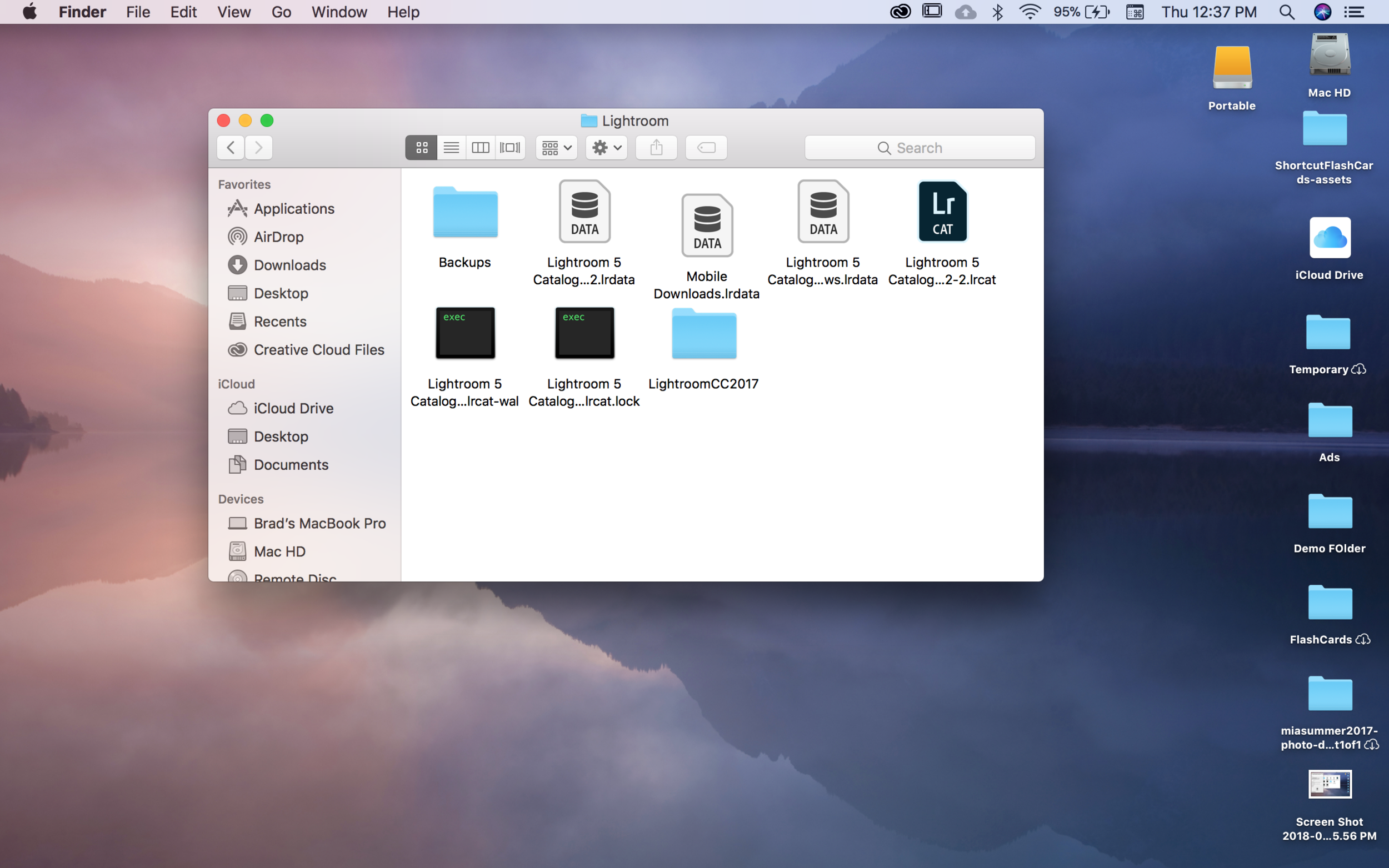
In the image above you can see the folder labelled "Lightroom" (this folder should be stored on a hard drive that is connected to your computer running Lightroom) and some folks are under the impression that this is where your images that you v…

In the image above you can see the folder labelled "Lightroom" (this folder should be stored on a hard drive that is connected to your computer running Lightroom) and some folks are under the impression that this is where your images that you view in Lightroom are stored - nope. It's not. Your original images are stored in the file, on the hard drive that you chose when you imported your images (you can view that tutorial HERE). Ok, so what's in the "Lightroom" Folder?

When you open the Lightroom Folder you will see something similar to the image above. You should have a Backups folder, a couple Data folders(the number can be different for everyone), the Lr CAT file - which IS your catalog, the Lightroom CC folder…

When you open the Lightroom Folder you will see something similar to the image above. You should have a Backups folder, a couple Data folders(the number can be different for everyone), the Lr CAT file - which IS your catalog, the Lightroom CC folder and possibly a couple execution (EXEC) files but these should only be present if you have Lightroom open.

When you open your Backups folder you will see all the backups that have been created (and hopefully you've been backing up). These backups contain all the information necessary to recover all the information from your catalog and that makes these f…

When you open your Backups folder you will see all the backups that have been created (and hopefully you've been backing up). These backups contain all the information necessary to recover all the information from your catalog and that makes these files rather large. Now, there is no need to have lots and lots of backups of the same catalog, so it's good practice to open the Backups folder every now and then and delete a couple of the older backups. My preference is to usually have 2 or 3 backups. 

The files labeled DATA are your Previews, Smart Previews and Mobile Downloads from the Lightroom CC mobile App. Do not delete these DATA files unless you absolutely know what you're doing! It is best practice to just leave these files alone - rememb…

The files labeled DATA are your Previews, Smart Previews and Mobile Downloads from the Lightroom CC mobile App. Do not delete these DATA files unless you absolutely know what you're doing! It is best practice to just leave these files alone - remember, you can discard 1:1 Previews and Smart Previews directly from Lightroom. The EXEC files should be ignored and only in rare circumstances will you need to delete them. It is quite likely you will go your entire life without even knowing the EXEC files existed as they are automatically created by Lightroom upon opening and automatically delete upon closing Lightroom. The LightroomCC2017 file (if you have it) contains your Lightroom CC (not Classic CC) Previews DATA file and CC Catalog. If you aren't using Lightroom CC  you don't need these files.

And there ya go! That's what is in the main Lightroom Folder - mostly stuff that should just be ignored. So hopefully that clears up what the folder is and helps you realize that it is quite different from the Catalog. Remember the main folder contains your Catalog but NOT your images. As always, feel free to leave your comments below or leave a question in the Facebook Group!

Lightroom Classic CC 7.3 Update

 
the lightroom learning group-logo-black.png
 

Lightroom Classic CC Update 7.3

 
Screen Shot 2018-04-04 at 11.11.05 AM.png

Earlier this week, April 3rd to be exact, Adobe released the 7.3 Update for Lightroom Classic CC as well as an update to Lightroom CC. The big takeaway is that there are now A LOT of profiles that you can choose from to give your image just the look you're after. Now to be clear there were Profiles before but they were pretty well hidden in the Camera Calibration Panel. Now the profiles get first class treatment right at the top of the Basic Panel and there are many more options. There are the 6 standard Adobe Profiles - Adobe Color, Landscape, Neutral, Standard, Portrait and Vivid plus the Monochrome Profile. There are also profiles meant to match the different modes of your camera - for example if your camera has a "vivid" setting you could load that profile - and also Artistic Profiles and BW Profiles, Vintage Profiles and Modern Profiles. 

You can find them via the Profile Browser that is accessed by clicking on the four squared grid just to the right of your current Profile. Adobe Color is the new default profile and that will load every time you open a newly imported image. When you do open the Profile Browser you can hover over each profile to see a preview on your active image. If you double click the profile it will activate that profile for your image, or you could click on the Profile and tap the close button to accomplish the same task. There is also an Amount slider which allows you to increase or decrease the effect of the Profile.

You can only have one Profile active at a time but you can switch Profiles whenever you like - being Lightroom it is completely non-destructive, of course. Profiles do not have an effect on your adjustment sliders and the best way to think of them, in my opinion at least, is as the base layer of your image. All the adjustments you make after selecting your Profile - tone, saturation, etc. - will effect that base layer but the base layer does not move your adjustment sliders to accomplish it's appearance. And that is where they are different from Presets. It can be easy to get confused between a Preset and a Profile but if you think of Profiles as that "base layer" then you can think of Presets as a group of "top layers". Presets can include all sorts of adjustments and slider adjustments can certainly be part of a Preset and you can even include a Profile within a Preset. 

Now earlier I had mentioned that Adobe updated Lightroom CC as well and I am pretty regular in my complete disregard of Lightroom CC but I feel it needed to be mentioned with this post. And what needs to be mentioned is that Lightroom CC also received the same Profiles as Lightroom Classic CC. It is also worth noting where Adobe placed these Profiles in Lightroom Classic CC - at the very top - as in they really want you to use them! This indicates to me that we are on the road to a singular Lightroom - no more Classic CC/CC confusion. When Lightroom CC was released it seemed basic but has since received the Tone Curve and the same Profiles as Classic CC and it just feels like they are building a bridge between the two. Of course this is just prognosticating on my part - and I could be very wrong - but logical thinking would tell us that that is where we're headed. I hope that Adobe is very careful in moving forward with Lightroom and I hope they don't make it too simple. When people are given the option of just tapping a button to create the image and appearance they want, I feel it takes away from the creative process and I feel the stronger a photographers' creative process the stronger the photograph. But let's move on...


profiles9.gif

There were a couple other updates to Lightroom Classic CC as well. Of course new Camera and Lens profiles were released but there are a couple more exciting things than that. The Tone Curve seems to be getting some love from Adobe (they must have read our recent blog post and watched our recent Videos as well 😉). It is now larger and more in charger - making adjustments easier and fine tuning is easier with the increased size as well. I am probably more excited about that than I should be. Also, the Dehaze slider makes its major league debut in the Basic Panel with the other Presence Sliders, which is where it belonged all along. If you aren't familiar with Dehaze it is best to think of it as Clarity on steroids. Through Adobe's magic it increases contrast and vibrance (among other things I'm sure) to remove "haze" or decreases contrast and vibrance to add haze to your image. Much like the Clarity slider I would suggest using it sparingly and with a soft touch as it can quickly turn your image a bit garish. 

The image on the left has a Dehaze value of -50 while the image on the right has a Dehaze value of +50

Alright guys, that's all I've got for now and as always feel free to leave comments below or post them in the Private Facebook Group! We'll talk to you soon!

Export as JPG

 
My Post Copy.jpg
 

Exporting As JPG and/or DNG

So when you get your image to a state that you're happy with and you're ready to share it with the world (or save a backup image) what do you do? Well you head to the "Export" panel. From there you will be smacked in the brain with a plethora of options. But don't worry, just like the rest of Lightroom you will have a workflow with the "Export" panel and eventually start a routine.

Screen Shot 2018-03-28 at 6.27.12 AM.png

So exporting is pretty much what the name implies, it is the process of taking your image information (because Lightroom isn't storing your actual photo), applying it to the photo(s) and creating or exporting a finalized version to your hard drive. You access the Export panel by right-clicking on an image or selecting multiple images from the Grid View and right-clicking (or ctrl+clicking) on an image. This of course brings up a context menu with lots of options and one of those options is "Export". Once you click that option the "Export" panel will open.

Screen Shot 2018-03-28 at 6.27.31 AM.png

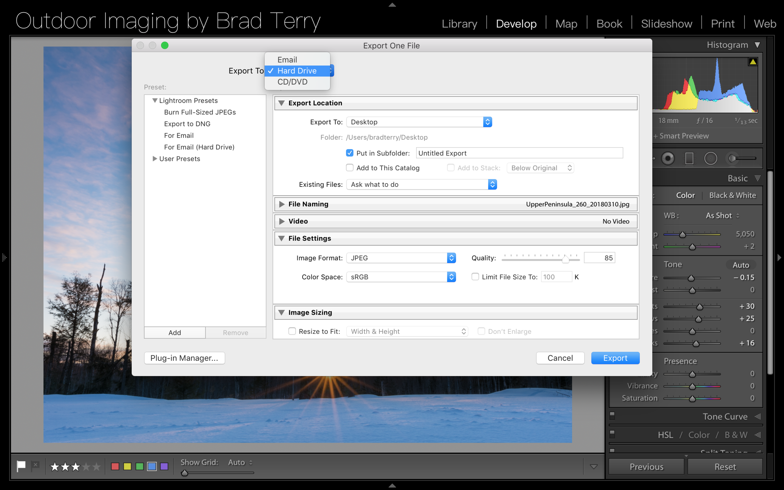
At the top of the panel you will see a drop down menu with 3 options for what you intend to do with the exported image - email, hard drive, cd/dvd. I will always select Hard Drive. This is simply my own personal preference and I do that because once I have that image on my Hard Drive I can choose later to send it in an email or burn it to a cd or dvd. I also generally do not use the "Presets" in the left panel - it is simpler for me to go through this simple process every time, though I can certainly see where creating my own preset would be beneficial. 

Screen Shot 2018-03-28 at 6.28.00 AM.png

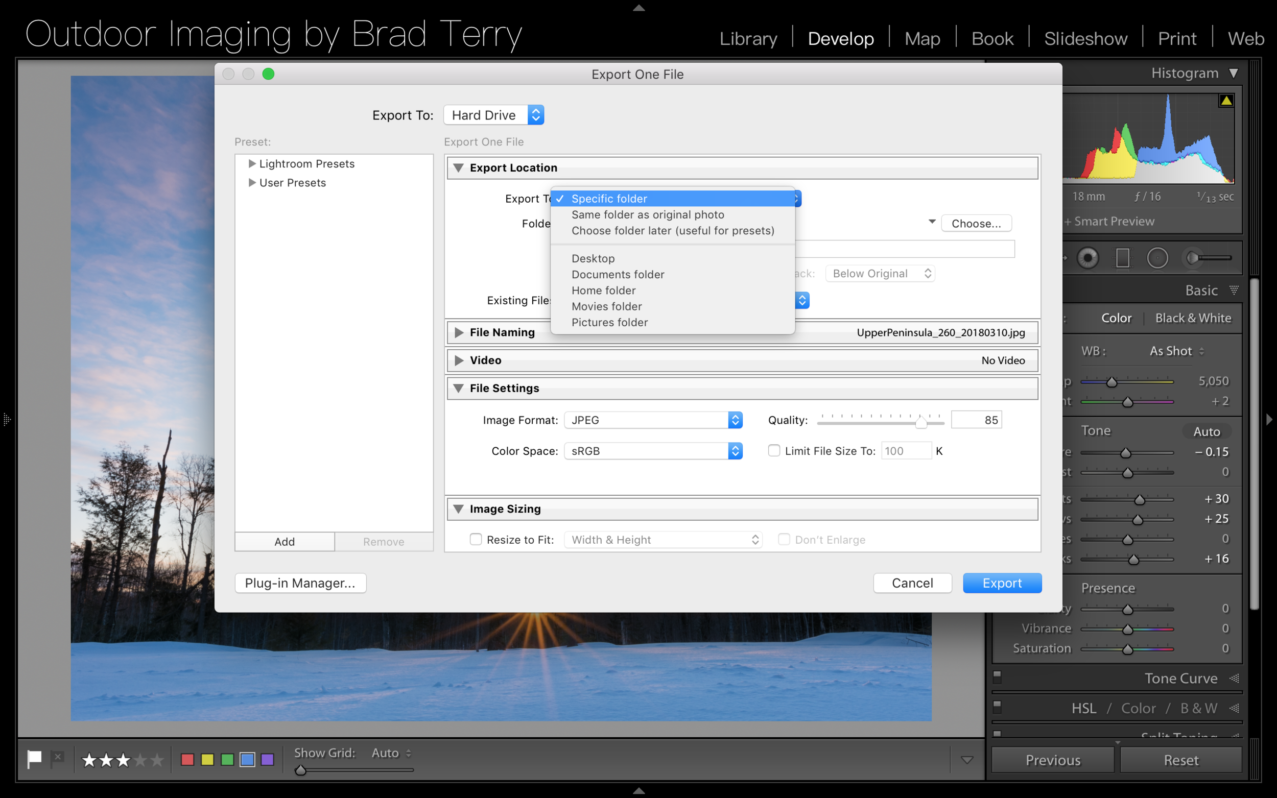
Then from there, I simply work my way down the panel. The first option is for Export Location. This is where, naturally, you choose where you want your image to end up. I will almost always select the "Specific Folder" option. This then allows me to choose the hard drive and folder where I want to save this image. (Tip: export a copy to Google Cloud so that way you have a backup in the cloud). After I choose where to store my image(s) I then move down to File Naming. Here you can... rename your file 😯. If you have a good file naming system in place - like we've discussed previously - you can skip this step but if you want to rename your image you can do that here. I will generally do a slight name change for images that I am exporting for social media. I want to be able to distinguish which files have Watermarks - so I do actually rename some photos.

Screen Shot 2018-03-28 at 6.31.39 AM.png

Video Settings is next but that gets skipped as I am not exporting a video and I don't believe I ever have. And that brings us to File Settings. Here you can choose what file format you would like your image to be exported as - JPEG, PSD, TIFF, DNG or Original. The vast majority of the time I will be (and you likely should be too) choosing JPEG or DNG. In my workflow I share images to social media - JPEG with Watermark - I also upload to my website - JPEG without Watermark - and I also create a final backup - DNG. So I am actually doing 3 exports for every 1 final image. When JPEG is selected it then gives you the option to choose "Color Space" - which should always be sRGB if it's going to be online - and you also get resizing options. Resizing can be helpful so that your image is the right size for sharing - not too big/slow but also not too small. I generally will resize my JPEGs to a "Long Edge" width of 1,024 pixels and a resolution of 144 with a quality of 85. This seems to give great results and uploads around the web quickly. When exporting as DNG (or any RAW format) you do not have resizing options or color space options. This is all predetermined by the original file size of your image and the color space of your DNG at export is irrelevant as it is determined by the program that you are running (Advanced Info: Lightroom uses the ProPhoto color space when in the Develop Module and Adobe RGB for the other modules).

Screen Shot 2018-03-28 at 9.35.26 PM.png

Next, if you're exporting a JPEG file you can choose to add some sharpening in the "Output Sharpening" section and if you're exporting for the web it's a good idea to add a little sharpening here. I generally select "Sharpen For: Screen" - the other options are "Matte Paper" and "Glossy Paper". I then select "Standard" in the "Amount" box - the other options are "Low" and "High". None of these options are available for DNG (or any RAW format) as most websites don't support them. 

Lastly is the Watermarking section. The watermark is, of course, text or a logo/image that identifies who the image was created by or has the rights to. There are quite a few aspects to the Watermarking section and I would like to go in depth with you guys on that, so we'll talk more about this feature later!

Alright guys, I hope you found this post useful and feel free to comment or send me a message if you have any questions!

My Develop Module Workflow

 
the lightroom learning group-logo-black.png
 
Screen Shot 2018-03-21 at 6.43.02 AM.png

So today I'm going to share with you my Develop Module workflow. This is what I have found works best for me. In an earlier post (here) I shared a general overview of my entire workflow process but this will be more specifically about the Develop Module. Lots of photographers get a little lost or overwhelmed when using the Develop Module, particularly beginners and particularly those who don't use a repetitive workflow - repetition creates habits and some habits are good! 

I find that the majority of my images are completed with as few as 6 tools/panels/steps but sometimes it takes up to 11 (and sometimes more). So listed below are the steps that I take and I pretty much always do them in this order because I like a repetitive workflow.

1. Lens Correction. This is just so simple that it doesn't make sense not to do it. In the Lens correction panel you can quickly remove Chromatic Aberration - the color fringes that can appear in high contrast areas of an image - that we have discussed here and also have Lightroom make some automatic adjustments for the particular lens that was used to create the image. These adjustments will potentially correct some exposure issues along with lens distortion - i.e. barreling - issues. 

2. Clone & Heal. Learning how to use the Clone and Heal Tool is absolutely essential to using Lightroom well and we covered this in a Video Tutorial that you can watch here. The importance is hopefully fairly obvious, we don't want unwanted spots and artifacts in our images - so we use the clone or heal tool to remove those. But maybe you're wondering why I do this so early on in the process - many photographers will do this later but I'll tell you why I don't. It's simply because of step 3, which - spoiler alert - is Cropping and Rotating. If I cropped my image before cloning/healing there may be areas of the image that still have artifacts or spots in it - everything outside the crop rectangle. But who cares, you won't be using that area anyway, you cropped it?? Well my friends, I'm a wishy washy kind of guy and there's a decent chance that I will change my mind later about the crop or aspect ratio of the image. If I do change my mind I don't want to go back and clone/heal again in the areas that were previously outside that crop area - the more I have to go back the more time I'm wasting and the more likely I am to forget! So do this step second - you'll be glad you did.

Screen Shot 2018-03-22 at 12.45.54 PM.png

3. Crop & Rotate. Cropping your image is an often overlooked area of designing your image or giving it the feel you're looking for. The non-destructive nature of Lightroom is absolutely key when it comes to cropping. You can crop your image over and over and over again and always end up back at the original aspect if you like. I recommend trying a few different crop ratios on every image just to give you a different perspective on the photograph. It might inspire you to not only look at the current image differently but look at future compositions differently.

4. Basic Panel. And now we move on to the Basic Panel, where a lot of the overwhelming begins. The Basic Panel is really anything but basic. You can do A LOT in the Basic Panel and sometimes all those options and sliders can start to seem like too much. I won't get into how I use the Basic Panel because I feel it's more beneficial if I give you some advice. If you're just beginning in Lightroom Classic ignore most of the sliders. If you're feeling overwhelmed with Lightroom, I want you to completely bypass the White Balance area of the Basic Panel and I want you to completely disregard the Presence portion of the panel - you'll come back to those later when you are more comfortable with the rest of the Develop Module. So that's going to leave you with the Tone section of the Basic Panel. In that section I want you to focus mainly on the Exposure, Contrast, Highlights and Shadows sliders. This is where the majority of your tone work will come from in this panel - leave the White and Black sliders for later. So now you can see how we've taken the Basic Panel and sliced it half - not so overwhelming now!

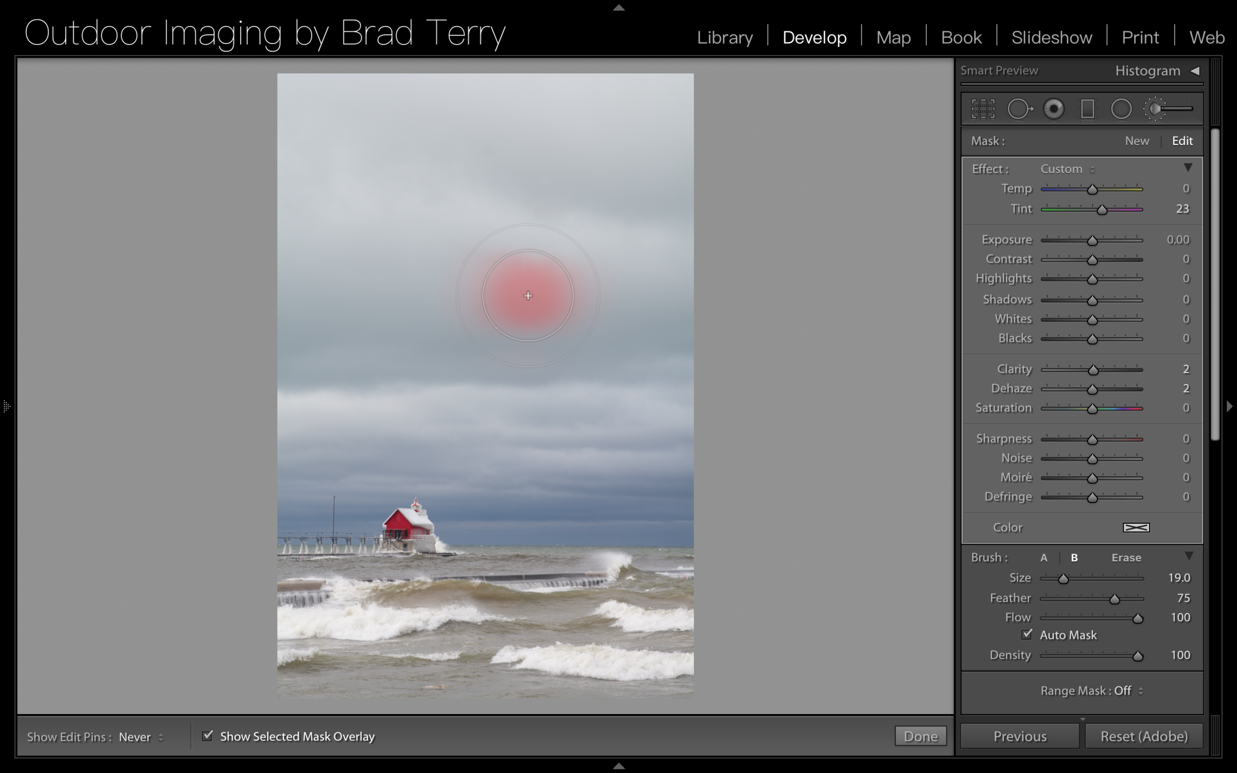
5. Adjustment Tools. After I do my global tonal adjustments in the Basic Panel I will then reanalyze my image and see where I want to make more localized changes. Of course those changes are going to be easiest with one of the Adjustment Tools in the Develop Module. We talked about the Graduated Filter in a tutorial here, the Radial Filter here and the Brush Tool here. Since we have discussed those at length in those Tutorials, I won't get into them here. But I will say that it is beneficial to think of them in sizes - if a large area needs adjusting go to the Graduated Filter, medium/small area - go to the Radial Filter, smaller yet or not well defined area - go to the Brush Tool. 

Screen Shot 2018-03-22 at 4.33.35 PM.png

6. Sharpening (Detail Panel). Potentially the final step in my workflow is Sharpening. And Sharpening should be done in the Detail Panel. You can add sharpening with the Adjustment Tools mentioned above but you should always do your global sharpening via the Detail Panel. I don't generally use the adjustment tools for sharpening - unless I'm going for a specific look - as this can add too much sharpening when you also sharpen with the detail panel. Too much sharpening can cause an image to look fake or garish and that's not a look I'm going for. Without getting too deep into sharpening, a good place to start is with a sharpen value of 75 and a radius of .5 - .8 pixels. This usually gives you a good and natural amount of sharpening.

7. Tone Curve. In my (sometimes) last step I will use the Tone Curve to add an "S" curve and give just a bit of extra contrast to the image. You can view the Video Tutorial on the Tone Curve here.

Now you can stop there and consider your image pretty well "final". But I'll list a couple more steps that I will occasionally take to further improve an image. If you're just starting with the Develop Module I would suggest reading the below steps but seriously consider putting them away for a rainy day after you've become more proficient with the Develop Module.

*8. Basic (again). After all of the above adjustments are done there may be occasions where more processing is beneficial. One of those areas is the Presence portion of the Basic Panel. Here you can adjust Clarity (think of this as texture or detail sharpening), Vibrance (think of this as detail or lite saturation) and Saturation. Sometimes you may find that "bumping" one of these sliders a little bit can help an image.

*9. HSL (Hue/Saturation/Luminance). I will sometimes use the HSL Panel to effect individual colors in an image - bringing some up in saturation or luminance and bringing some down. There is no magic formula when using this panel, it's a lot of trial and error.

*10. Transform. Sometimes an image can look skewed or crooked or maybe sometimes look tilted in a certain direction. This can be corrected in the Transform panel but be careful, small adjustments can go a LONG way. I suggest if you're using this panel to make sure you have the "Constrain Crop" box checked so you don't end up with white edges or corners.

*11. Vignette (Effects Panel). In the effects Panel you can add Grain - which I never have, Dehaze - which I never use outside of the Adjustment Tools and Vignette - which can actually add a nice effect. You can add a light or dark Vignette via the effects panel (I usually go dark) and you can control the feather and size of that Vignette as well. However, since the introduction of the Radial Filter in Lightroom 5, I usually use that in place of the Vignette.


And there ya have it! That's my Develop Module workflow. I really hope you all find this helpful and feel free to leave any comments below or post questions to the Facebook Page. Now, just to do a quick review/rundown here is the list without the descriptions/explanations.

  1. Lens Correction
  2. Clone & Heal
  3. Crop & Rotate
  4. Basic Panel
  5. Adjustment Tools
  6. Sharpening 
  7. Tone Curve
  8. Basic (again) *
  9. HSL *
  10. Transform *
  11. Vignette *

    (* = not recommended until comfortable with previous steps in the Develop Module)

The ONE thing you NEED to be doing in Lightroom!!

 
the lightroom learning group-logo-black.png
 

So... this post isn't going to tell you the one magic thing you need to be doing in Lightroom. Sorry. This post is a bit of a rant. Why am I ranting today? Because I am sick. and. tired. of. people saying do this ONE thing in Lightroom and your images will be AWESOME!!

Ok, so maybe sometimes they say do "these 3 things" or "5 things" but I think you get what I am going for here. And these aren't just random people. I have been seeing these for years coming from viable people and groups. Guys, this isn't easy stuff. Sure there are little tips and tricks to learning Lightroom but you aren't going to learn how to use Lightroom well with little tidbits of information and there certainly isn't just one or two things that you need to be doing in Lightroom - there is a laundry list of things that you should be doing. And sometimes that list seems overwhelming but I promise you this, the more you use Lightroom and actually understand what you're doing - not just doing some quick "hack" that someone on Facebook is pushing - the easier the list gets. 

Think about driving a car for a second. That seems pretty easy, right? You've probably been doing it for a while. But what about someone just starting to drive? Doesn't seem so easy to them! There is a long list of things you need to be doing to drive a car and you probably think about nearly ZERO of those things when you get in the car! First there's unlocking and opening the door. Then you have sit down and buckle up, insert the key, depress your brake, turn the key, put it in gear, check your mirrors, let off the brake, hit the gas. And that's all before leaving the driveway! But how much of that do you think of when you're actually doing it? Not much. 

It isn’t going to happen overnight and it isn’t going to happen next week.

Lightroom is the same - well without  the mirrors of course. If you're just starting out there is a long list of things you need to be aware of but once you've been using it for a while, well things become second nature. It isn't going to happen overnight and it isn't going to happen next week but eventually you will be comfortable and confident with Lightroom. I am fairly proficient in Lightroom and guess what - it took me a LONG time! But now that I have been using the program for a long time, things come quicker and new features quickly become second nature. There is no magic bullet, no golden ticket and no quick hack that is going to make using Lightroom easy. There is a process and a - wait for it.....  WORKFLOW that will make Lightroom easier for you and that's a big part of what the Lightroom Learning Group is about. Yes, you're going to learn "quick tips" here but no those aren't the only things you'll need to know. They are pieces of the workflow puzzle. 

Learning Lightroom is a process and it can take a while - there's a lot to learn. You want to know how to best Develop your images and use the adjustment tools. You want to to know how to organize and label your images. You want to know the best practices for importing your images. You want to know how to recreate a certain look in an image. You want to know how to print and share your images. I know it can seem like a lot and it is, but it's also pretty incredible that one piece of software can help you with ALL of that - and it's also pretty incredible that you can learn how to use it efficiently and and in a way that is best for your specific workflow. But, again, it's just not going to be done with one or two or three or four actions or commands or presets. 

Now I'm not saying ignore everyone and everything you read about Lightroom just because it sounds too good to be true. But remember if something sounds too good to be true, it usually is. Lightroom is a big piece of the photography puzzle and a huge factor in having a better photographic workflow. Learning how to use it correctly - not necessarily quickly - will result in better images. Yes it can be frustrating but  keep driving that car - it will get easier! 

The Tone Curve

 
the lightroom learning group-logo-black.png
 

The Tone Curve. Once everyone's favorite tool in Photoshop has been relegated to backup adjuster in Lightroom. Let's be honest, when was the last time you used it? It's been a while hasn't it? That's ok, I understand, the sliders and Graduated Filter and all the other options in Lightroom have made the Tone Curve a bit of an afterthought. But that doesn't mean it isn't useful or you should continue to ignore it! It still has plenty of life left and we'll talk about it in this post.

Screen Shot 2018-03-06 at 3.04.21 PM.png

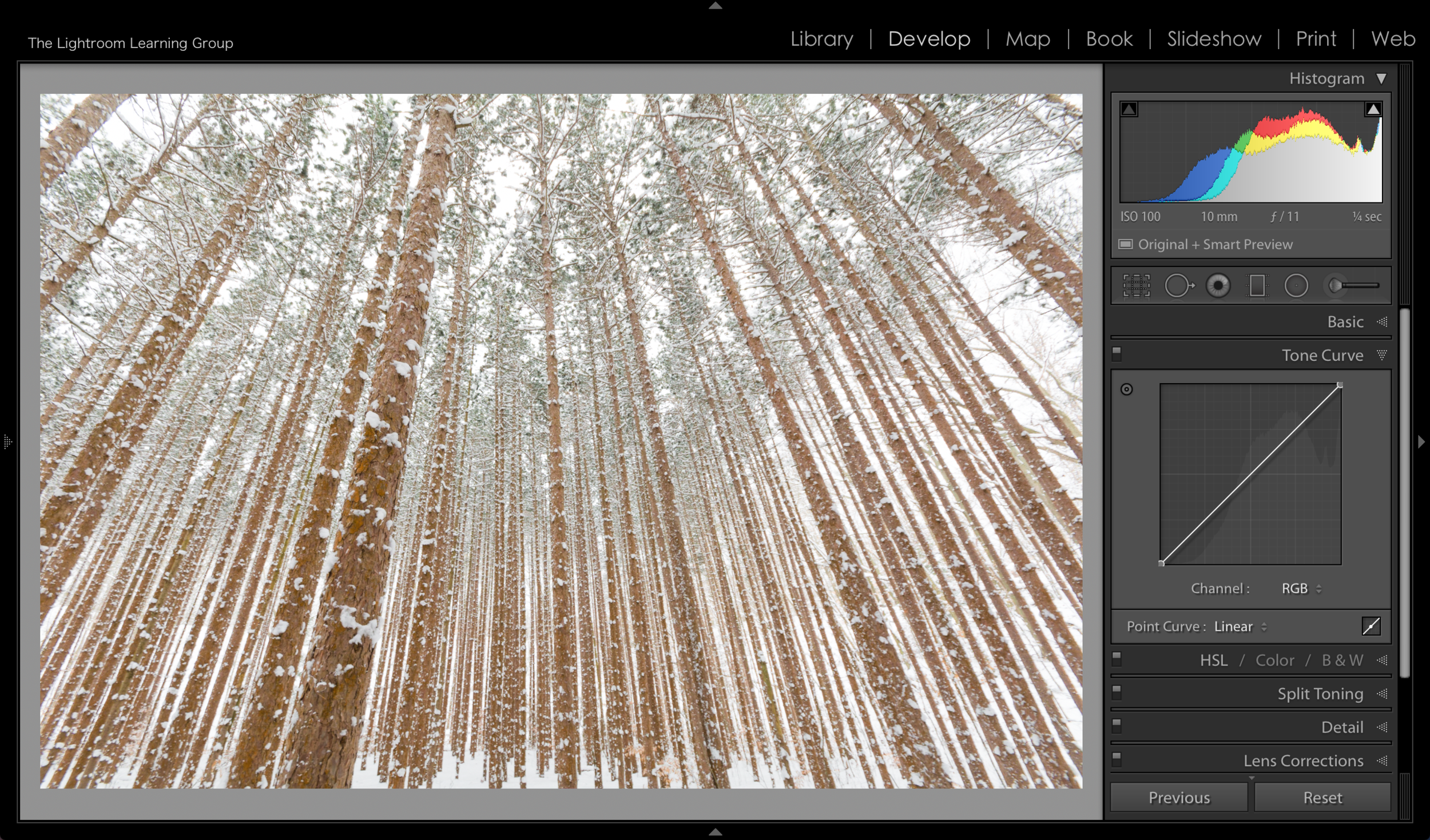
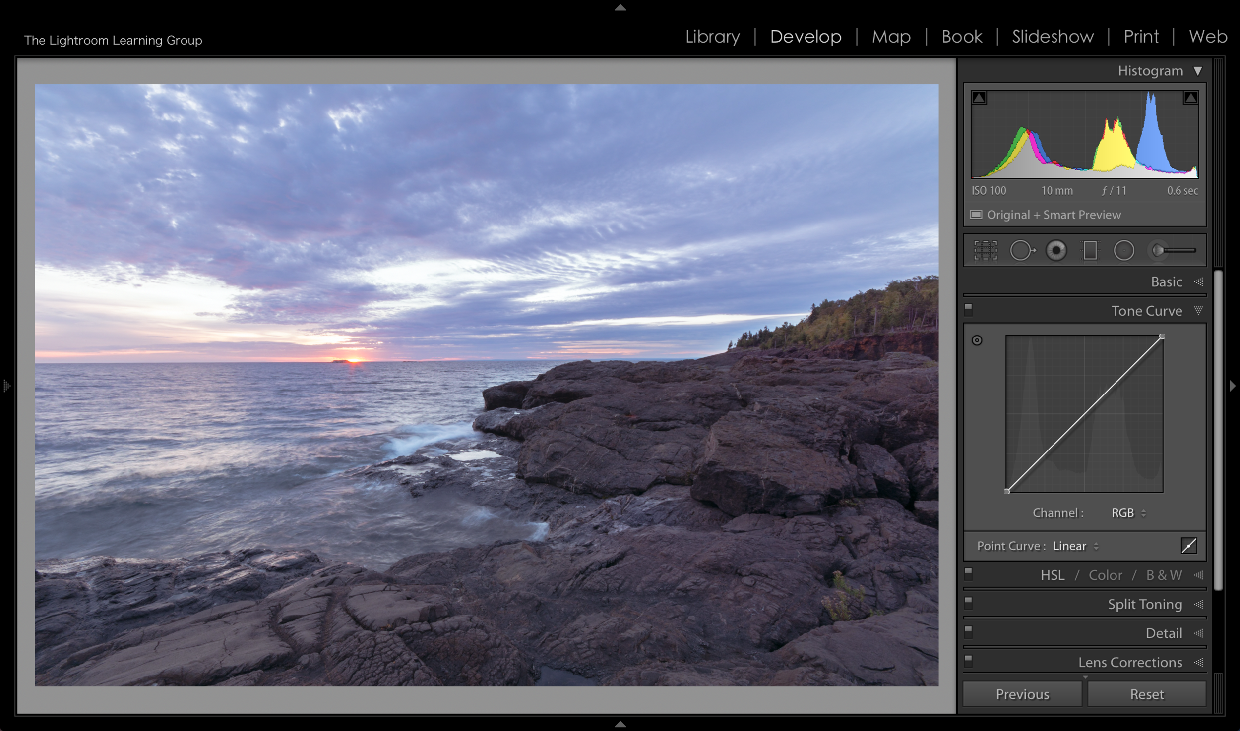
Just below the Basic Panel you will find the Tone Curve Panel. And what you are actually looking at is box with a diagonal line going from the bottom left to the upper right corner. This box represents the tone of the image, with the top of the box representing 100% White and the bottom of the box representing 100% Black. The diagonal line connects the black and the white tones and when you move the line the surrounding tones move with it - with ends or anchors remaining in place. So at the very basic level it can be used to brighten or darken your image. But of course, since this is Lightroom, it can do a lot more than that!

I think the best way to show you the Tone Curve via a blog is with pictures. So that's what we'll do. 


Screen Shot 2018-03-06 at 3.12.28 PM.png

Grabbing the center of the Curve line and pulling down will make your image darker. The farther you pull down, the darker the image will get. Note that next to Channel it indicated that we are working in RGB. This the default and you can work on individual colors, which we'll get to momentarily. 


Screen Shot 2018-03-06 at 3.12.11 PM.png

Grabbing and moving the line up will make your image brighter. When you grab in the middle you are essentially "grabbing" the midtones and you can see how it effects tones to the left and right of where you grab, with the effect being less toward the "anchors".


Now, you can move the anchor points but I don't really suggest you do (although I'll show you a cool trick in an upcoming video where you DO move an anchor point). In the images below you can see what happens when you move the anchor points to be directly across from each other - making a straight line. Other than helping to demonstrate where the highlights, midtones and blacks are on the Tone Curve box I don't see any other benefit to moving the anchor points - at least in such a dramatic way.

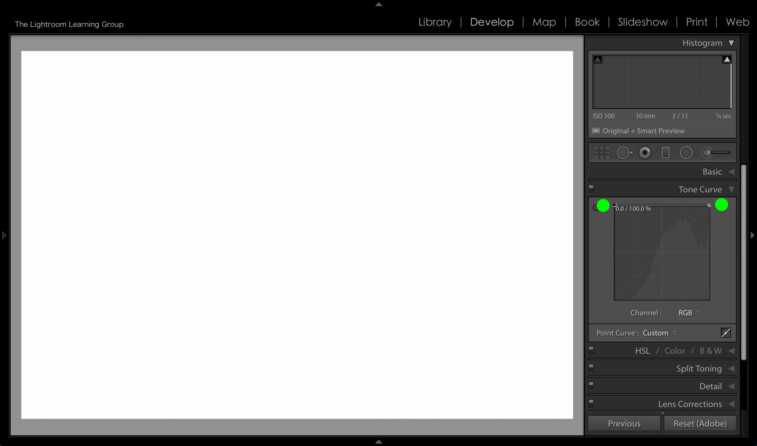
When you place each anchor point at the very top of the Tone Curve box your image becomes pure white.

When you place each anchor point at the very top of the Tone Curve box your image becomes pure white.

When you place the anchor points across from each other in the very middle of the box you get a 50% gray image.

When you place the anchor points across from each other in the very middle of the box you get a 50% gray image.

When you place the anchor points directly across from each other at the very bottom you will get a black image.

When you place the anchor points directly across from each other at the very bottom you will get a black image.


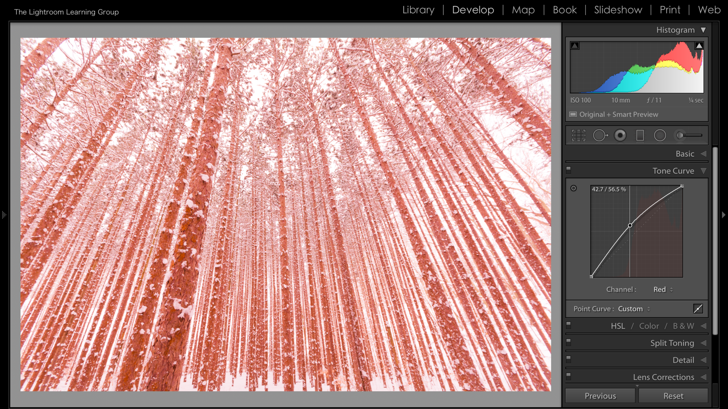
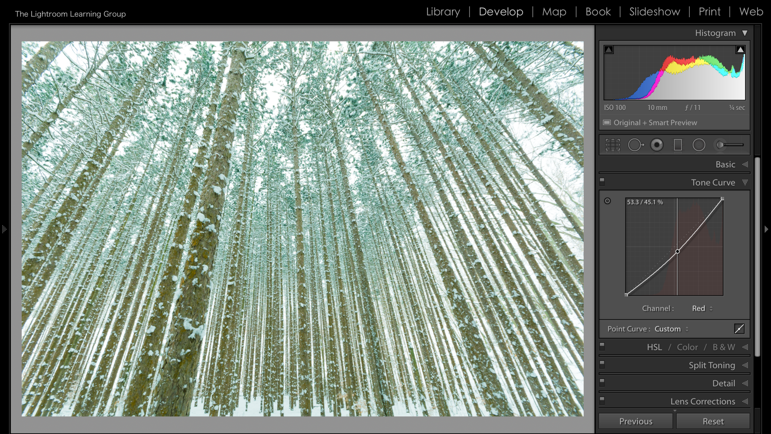
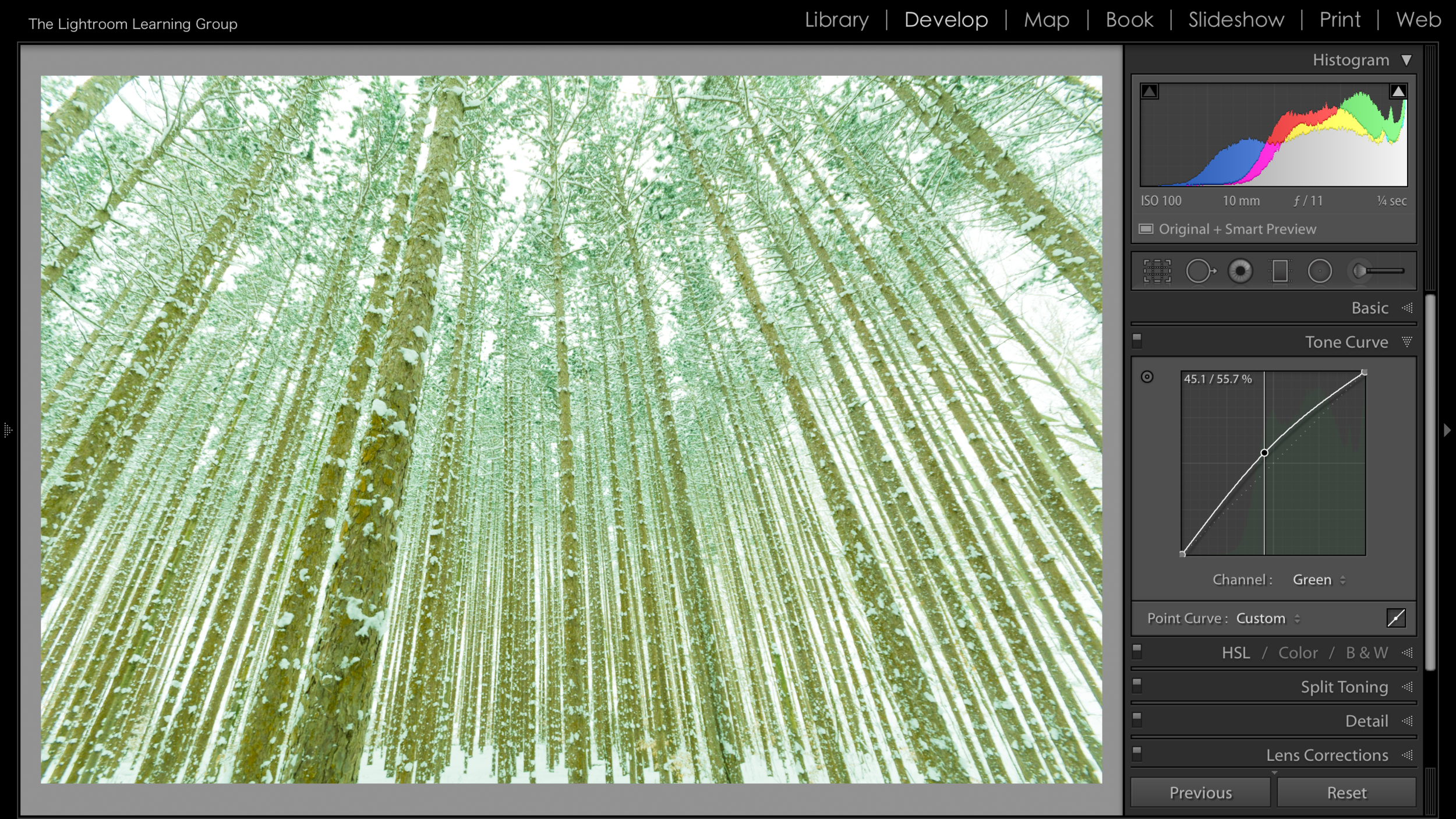
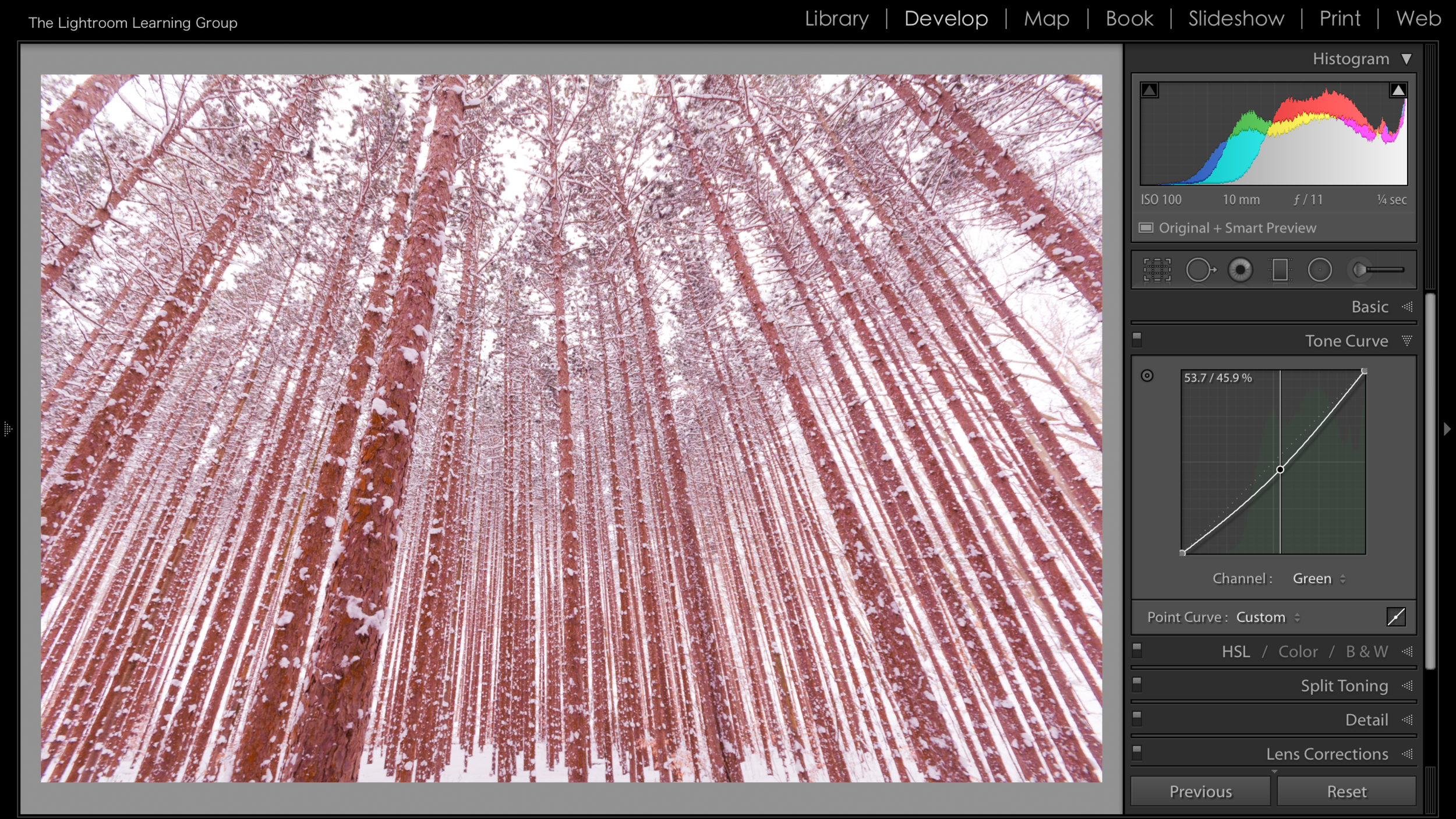
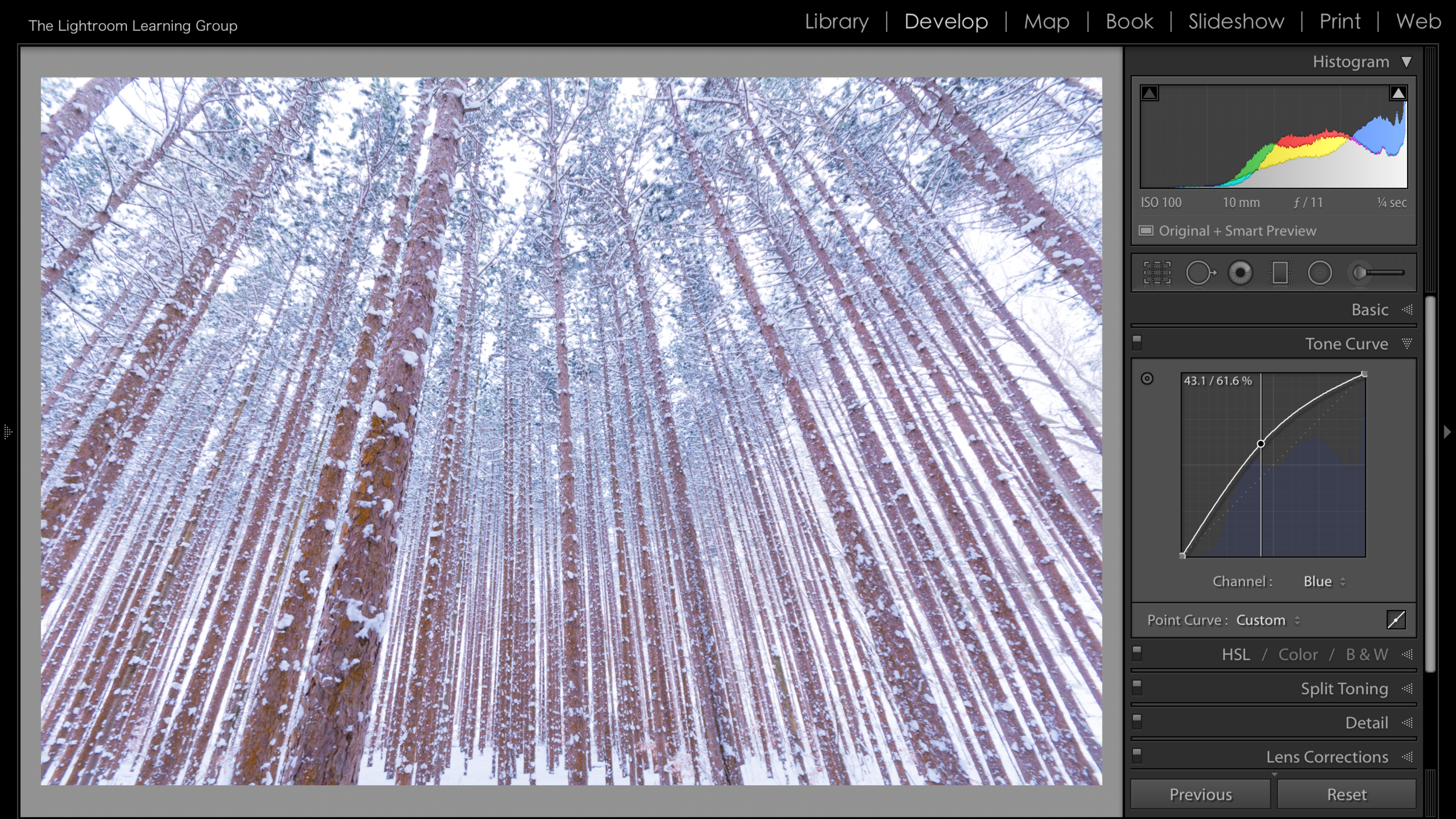
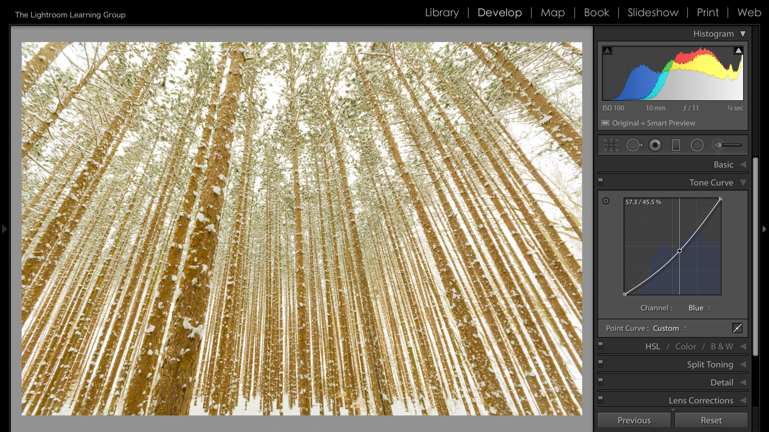
As we discussed earlier when you are in the RGB Channel you are adjusting all of the colors in the image. But you can click on the double arrow next to RGB and select individual color channels - Red, Green or Blue - and add different color tones.

In the images above I chose to work on the Red channel and you can see that by moving the line in an upward direction Red is added to the image. When I pull down on the curve I am removing Red - essentially adding Cyan.


When we select the Green Channel and move the curve up we add Green and when we move it down we remove Green - or add Magenta.


Lastly is the Blue Channel. And when the Curve is pulled up, Blue is added to your image. When it is pulled down, Blue is removed - or Yellow is added.

So you can see that there are definitely benefits to using the individual color channels - they're really nice for adding just a tint of color. But use the Curve with a delicate touch, a small move goes a LONG way.


Screen Shot 2018-03-06 at 2.38.32 PM.png
Screen Shot 2018-03-06 at 2.38.34 PM.png

You can also tap on the small Curve Box in the bottom right corner to open the Regions Slider(next to the green dot I placed in the image). This is fairly self explanatory and is of course rather similar to the sliders of the Basic Panel. I rarely use the sliders here in the Tone Curve. I just feel the Tone Curve is for clicking and grabbing, maybe it's the leftover Photoshop still left in me. If you want to use them go right ahead but I prefer not to.


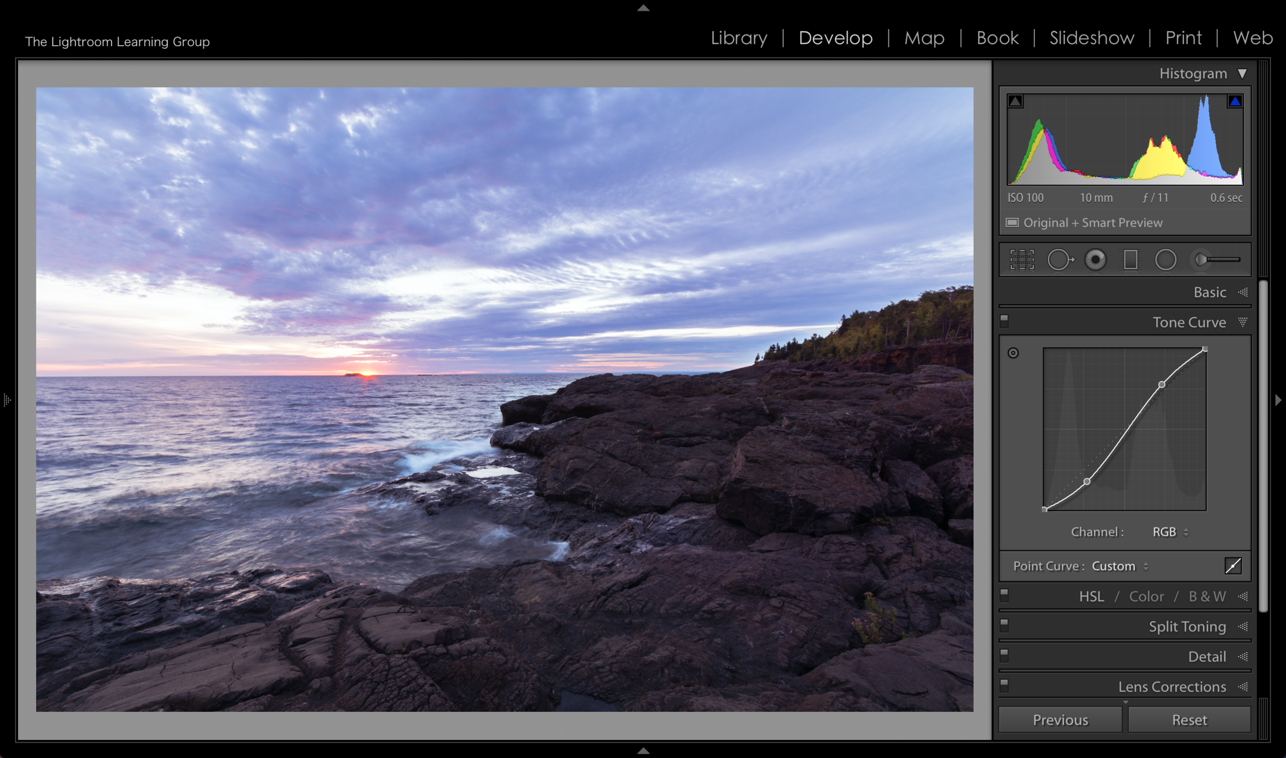
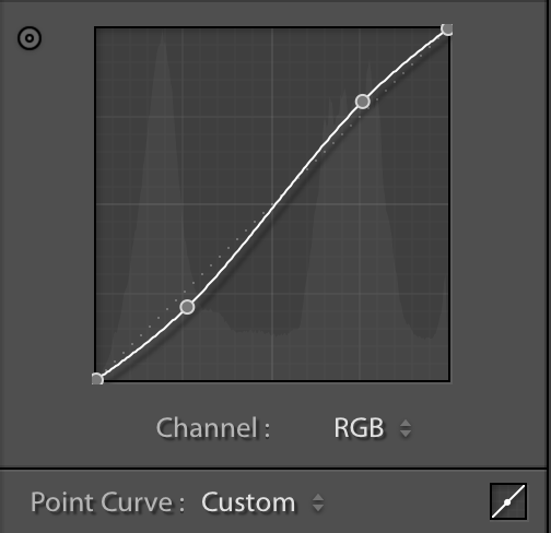
And now we can talk about my  favorite way to use the Tone Curve. And that is to add contrast. There is something about using the Tone Curve instead of using the Contrast Slider of the Basic Panel that seems to give an image better contrast. It just seems to "pop" more, maybe it's just me. But if you look at the before and after image below (yes, I am excited that I can now use before/after slider on the website 🤓) you can see what adding a fairly gentle "S" curve does to an image. 

To create an "S" Curve you need to place 2 points on the curve. And this where the grid of the panel comes in handy. It is separated into 16 larger blocks (and 400 smaller blocks if you're counting). That leaves 3 converging points on the straight curve line (is that an oxymoron?), where the larger boxes meet. Thus you can easily picture the line in 3rds. You will generally get good results by placing a new anchor point on the first and last of the 3 converging points. Pull the first (lowest) point you placed down a little bit and pull the second (highest) point you placed up a little bit. This will create what appears to be a gentle "S" on the curve and add a pop of contrast.

Screen Shot 2018-03-07 at 2.12.13 PM.png

There ya have it! Just about everything the Tone Curve has to offer! I know it's not an often used tool but give it a try, you might really like it!

Snapshots and Virtual Copies

When working on an image in the Develop Module you may have noticed a panel designated for Snapshots, it lives just under the Presets Panel on the left side. And the name pretty much gives away what it is - a quick snapshot of the image you are working on. But are they really helpful and how are they different from Virtual Copies? What is a Virtual Copy anyway you ask? We'll get to that in a minute.

Note the different Snapshots in the panel. As you create them they will be listed alphabetically. 

Note the different Snapshots in the panel. As you create them they will be listed alphabetically. 

So is a Snapshot helpful? Well first, let's be clear as to what a Snapshot truly is. A Snapshot is just a saved history state of your image. To create a Snapshot what you should do is open the Snapshot Panel and tap the plus symbol - this will create a Snapshot. When you tap the plus symbol to create the Snapshot a dialog box pops up asking you to name the Snapshot or keep the Date and Time stamp name that comes up by default. I suggest changing the name to something more useful than the date and time. Hit "Create" and voila you have a Snapshot - a saved history state of your image. And yes, it can be helpful. You can create multiple Snapshots of an image at multiple stages of the Develop process. In the image in this post I created a Snapshot immediately after I adjusted the Chromatic Aberration and Lens Profile. I then hit the "Auto" Exposure button and created a Snapshot after that. I kept working from that point and made another snapshot after doing some Temperature and Exposure adjustments. I also decided that I wanted to see what it looked like in Black and White so I converted to Black and White and created another Snapshot. I can simply click on any of these Snapshots and Lightroom brings up the image just as it was when I created that particular Snapshot. So it gives you a lot of leeway to experiment and try new things without having to worry about how to get back to a certain point of your Develop Process. 

Screen Shot 2018-02-21 at 8.57.18 PM.png
Screen Shot 2018-02-21 at 8.57.37 PM.png

The other thing that can be helpful when using Snapshots is the "Sync Snapshots" feature in the "Settings" Menu. This allows to sync certain attributes or adjustments that have been made since creating a Snapshot. To sync the settings simply go to the "Settings" menu and select "Sync Snapshots..." and remember wherever you see an ellipsis (...) there are more options to follow. The options in this case is a plethora of develop settings that you can choose to synchronize across the Snapshots. A good example would be if you used the Clone/Heal Tool to do away with some imperfections, you could select that as an option to sync across Snapshots. As you can see in the nearby image the options are many! And if you're curious there is of course a keyboard shortcut for creating a Snapshot and that is cmd(mac) or ctrl(pc) + N.

But if you've ever used or heard of Virtual Copies this can all sound quite familiar and you might be wondering how the two differ. While a Snapshot is a saved history state, a Virtual Copy is a proxy copy of the master file. And since it is a copy - and not just a saved history state - it gives you more flexibility than a Snapshot. How so? Good question! Once you create a Virtual Copy it gets stacked with the original file in the Library, so you can see the different versions side by side in the Grid View and you can then also use the compare modes to analyze your different versions of the image. Most importantly - in my opinion at least - you can place Virtual Copies in Collections. So if I have a color version of a photograph and a Virtual Copy that I converted to Black and White I could, for example, add the Black and White version to my black and white Collection(collections are something we will be talking about soon). When you do create a Virtual Copy you will be able to tell what image is a Virtual Copy in the Grid View by the "turned up corner" in the lower left of the thumbnail image. And of course there is a keyboard shortcut for creating a Virtual Copy and that is cmd(mac) or ctrl(pc) + ' (apostrophe).  

Notice the "turned up corner" on the thumbnails in this screenshot indicating Virtual Copy.

Notice the "turned up corner" on the thumbnails in this screenshot indicating Virtual Copy.

Alright! So now you hopefully understand what a Snapshot and Virtual Copy are and how they can be beneficial to your workflow. If you have any comments or questions please feel to contact me and you are always welcome to post any questions to the Facebook Group Page.